top of page
Project: Visa Card - Guided Buying e-Commerce Site


Image: Original Visa UI

Image: Updated UI
Overview:
I designed the internal e-commerce buying system at Visa Card.
In this system, users could purchase a variety of items ranging from: computer mice, to big ticket items such as: furniture, server rooms, and even advertising campaigns for sports events such as the Olympics.
This system serves over 30,000 employees internally.
The Problem:
When I was brought onboard, the existing tool for buying items at Visa was a spreadsheet running on Oracle.
Roles
- Product Designer
- UX Researcher
- Visual Designer
Project Deliverables
- Code handover to Dev team
- Wireframes
- High Fidelity Visual Design
Tools
- Sketch
- Zeplin
Initial Pain Points
Problems with the existing system included:
-
No images or information about catalog items
-
Hard to find purchase codes needed to complete a purchase
-
Users timed out about 35% of the time.
Step 01: User Interviews
I interviewed nearly twenty users.
They varied in their shopping habits.
Some users only bought items a couple of times per year.
These could however, be big ticket items, such as
a million dollar advertising spot at the Superbowl.
Other users shopped more often, buying office
accessories once or twice a week.

Step 02: Think Aloud Testing
I had users go shopping on the original site and tell me what they were thinking at key steps in the process.

Findings Re: Visa's Internal App
-
No images of products.
-
No product descriptions.
-
Users would be timed out minutes before they could complete their purchase.
-
Long ramp up time to learn the system.
-
Unable to view dimensions or weight of products.
The Big Picture
-
In short, the buying process at Visa was broken and antiquated.
-
In a post-Amazon / Shopify world,
management believed they could do better.
Image: User Interview Questionnaire
"This is the hardest shopping system I've ever used!"
- FS, Age 36
Step 03: Crafting Personas
Once these interviews were complete, I gathered insights into a set of Visa's user behaviors.
These were distilled into personas and used for reference throughout the design process.
As we designed new features, the dev team and executives could ask questions like,
"Is this how Jeanette would buy office equipment?"

Image: A Persona Used in this Case Study
Step 04: A Journey Map
My next deliverable was a journey map to give stakeholders at all levels, an idea of the different touch points a user would encounter while buying particular items at Visa.

Image: The Journey Map
Journey Map Findings:
The journey map reinforced the notion that Visa's shopping experience was not very forgiving.
The Journey Map showed:
-
The system frequently surprised and betrayed users.
-
They were not very confident that the item they were buying would get through the shopping funnel. They had to repeat their path down the shopping funnel 25% of the time.
-
Users found the entire shopping experience frustrating.
Step 05: Visual and Interaction Designs
Mobile Designs
The mobile designs were responsive pages.
To design the Mobile UI, I started out by whiteboarding some ideas.

Image: White Boarding Mobile Designs
From Sketches I Proceeded to Design Wireframes

Image: Mobile Wireframes
Visual Designs - Mobile
Once I had buy in from stakeholders on the wires, I got to work on visual designs.
Below are the landing page the user sees on their mobile device.
Also visible is the "Computers," landing screen.
Here the user drills down further to an individual laptop's product page.
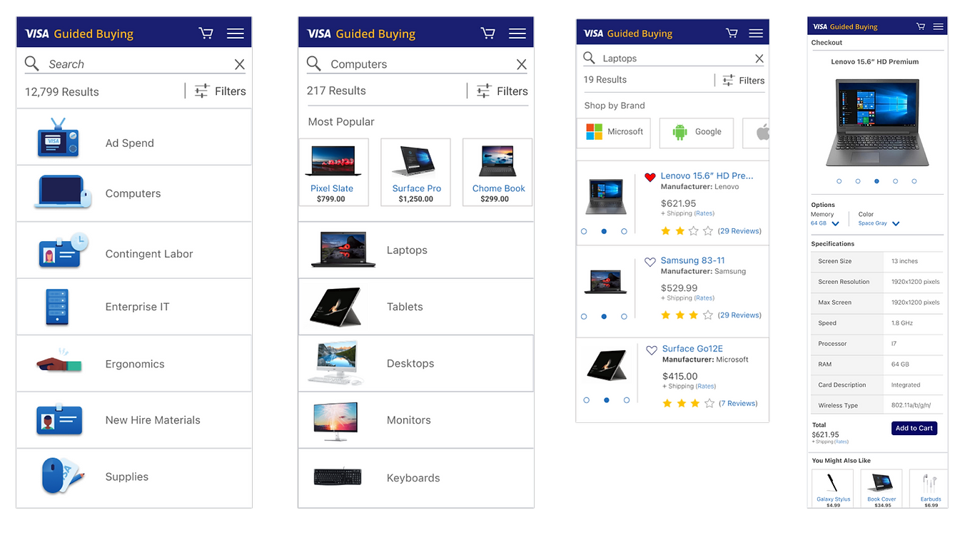
Image: High Resolution Mobile Mockups
Visual Designs - Desktop
Below are designs for the Desktop or, "Web," version of the site.
On landing, the user sees the following screen.

I brought in the feature of "Search with Typeahead functionality."
If you were looking for say, a laptop, then related terms would also show up below the search field.
These might include other models, brands, or accessories such as desks.
Image: Desktop Screen with Search Autocomplete.
Search Results
Here the user conducted a search on "Computers."
Faceted Search appears to the left and lets them narrow down their query.
By default, search results are displayed on a grid.
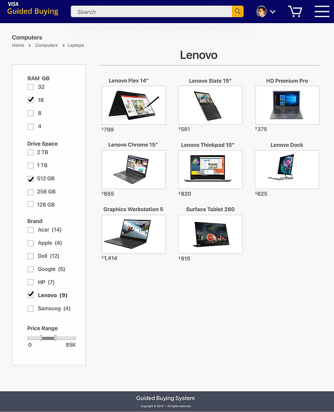
Image: Search Results by Product Line

Image: Product Detail Sceen
Wrapping Up
User Test Findings
Once we had prototypes ready to go, it was time to run Phase II of user testing.
Users performed tasks on an interview prototype of the new site running on InVision.
In all, users were able to accomplish 90% or more of the eight tasks that were assigned to them in this exercise.
Pain Points:
Four users had minor trouble finding the correct category on the landing page.
To that end, the shopping system could have benefitted from the use of more meaningful names at the top level of the site. We were constrained a little in naming, due to branding guideline requirements. Some users also complained that the site was not, "Amazon," enough. That said, this same cohort found the site, easy to use.
Users Liked:
-
Visual presentation of catalog items.
-
Smart search and string completion - Found to be intuitiive to 83% of users.
-
Shipment tracking made sense to 81% of users.
-
Cart usage was simple and intuitive, resembling the same functionality on external, better known sites.
Thank You
You might also like:
AssetMark Fintech
bottom of page